This Sandymount extension transformed the space, but didn’t even need planning permission
A two-storey structure full of light and warm details, it didn’t need planning permission thanks to a compact and clever design.
When it comes to extending a house, it can be tempting to think that bigger is always better, but this Sandymount home shows the difference even a small addition can make.
The compact nature of the design by David Flynn Architects meant that the project was achieved without planning permission, which helped to speed things along.
Architect Vanessa Carron explains that the 1950s house didn’t work for its owners. “The layout was inefficient and cramped with disconnected living spaces, and the kitchen was located in a small extrusion to the back of the house.”
This created a two-fold problem. “It wasn’t just a small room unsuitable for a young family, it also prevented light from penetrating the rest of the house. As the existing garage blocked any low morning light getting in from the east, the house felt cold and dark.”

Top of the family’s wishlist was an open plan kitchen, dining and living space, and they also wanted to add a home office and an additional bedroom.
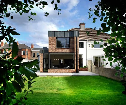
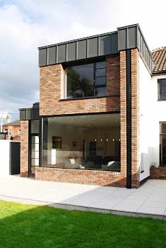
The plan for the extension is compact and doesn’t exceed the elevation of the original house, allowing it to be exempt from planning permission. It was also designed to minimise the impact on neighbouring homes, offset from the boundary walls to reduce overshadowing, and windows positioned so as not to look in on others.

“The original floor level was also lowered at the rear of the house allowing high ceilings without raising external walls past the original eaves,” Vanessa explains. “This intervention, along with the play of interlocking planes to the rear elevation has the effect of lessening the bulk of the extension.”
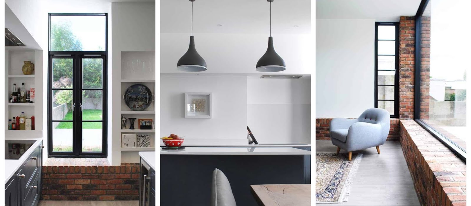
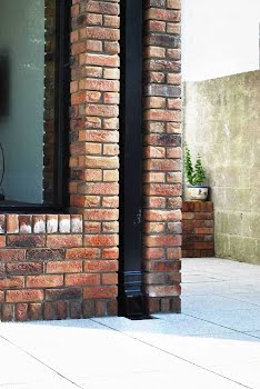
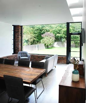
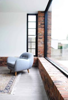
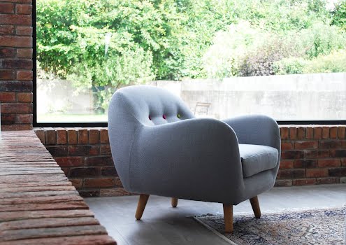
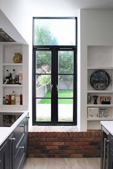
The extension has echoes of the original home. The front exterior of white plaster and red brick is carried through to the new interior of the extension. A low brick ledge runs around the perimeter of the new space, forming shelving and window seats in places.

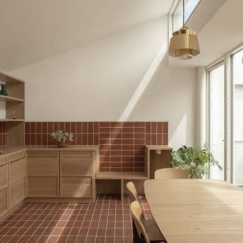
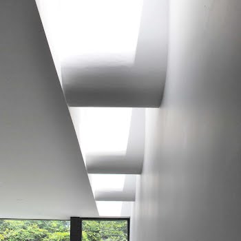
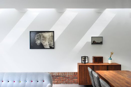
The space is north-facing, which meant it was a challenge to make it feel bright, but windows at multiple angles have helped to do this. A series of roof lights, interspersed with sculpted plaster curves, also allows light and shadows to move through the space during the day, creating beautiful effects. “They create a wash of light down the wall from morning to evening,” Vanessa says.
On the first floor, the existing master bedroom got a new ensuite, while the new double bedroom in the extension is bright thanks to a large window overlooking the long garden.
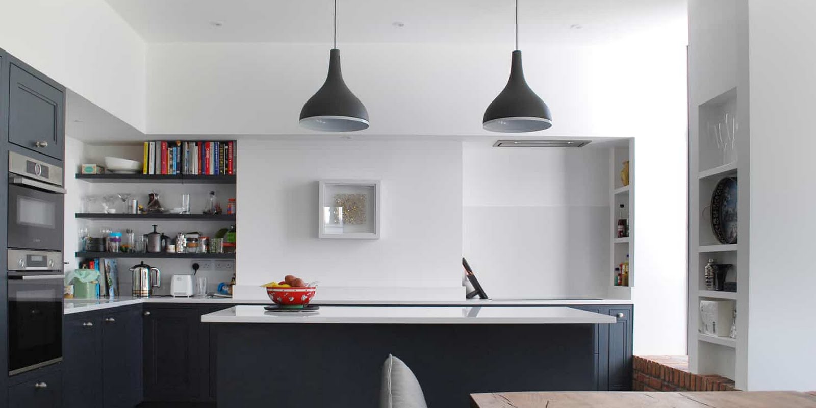
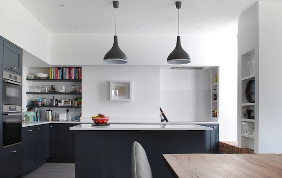
Everywhere, small details have been considered as well as large. The calm kitchen space has plenty of built-in storage and shelving. A large brick ledge forms a window seat, and you can reach out of this window to access the herb garden that sits in brick planters just outside.
One of the most successful aspects of this project, Vanessa says, is that the main family space no longer feels north facing — cold and dark. “The kitchen is a far cry from the small dark extrusion tacked on to the back of the house. The family now have a warm, bright open plan space that they can enjoy throughout the year.”
This article was originally published in May 2022.


